Phumulani Zwane_Architecture
Monday, 20 October 2014
Tuesday, 14 October 2014
University of Pretoria: Administration Building
I thought I should share one of the buildings that always catch my eye, and I could never get fed up of seeing it. The University of Pretoria Administration Building by Brian Sandrock.

Sketch-up Model by Miss C D Deacon
"In 1965 it was decided to construct a new administration building and UP alumnus Brian Sandrock was commissioned for the design. He designed an interesting three-cornered, star-shaped building which was completed in 1968. By 1973 additional office space was required and Sandrock was again commissioned to design a wing to the east of the building. Construction on this wing began in 1979 and was completed in 1986. The wing includes the offices of the Principal, Council Chambers and the Senate Hall. The building shows traces of Neo-Brutalism and is shaped like a ship – hence the student name of Die Skip (The Ship). The north-western facade of the building comprises an intricate relief mural which adds texture to the otherwise bland concrete wall. Sandrock later commented that there was no symbolism behind the design and that it was simply the result of doodling in plaster of Paris late at night while he worked on the model of the building. Sketchup model drawn by Miss C D Deacon"
Ref: http://repository.up.ac.za/handle/2263/6558
Wednesday, 8 October 2014
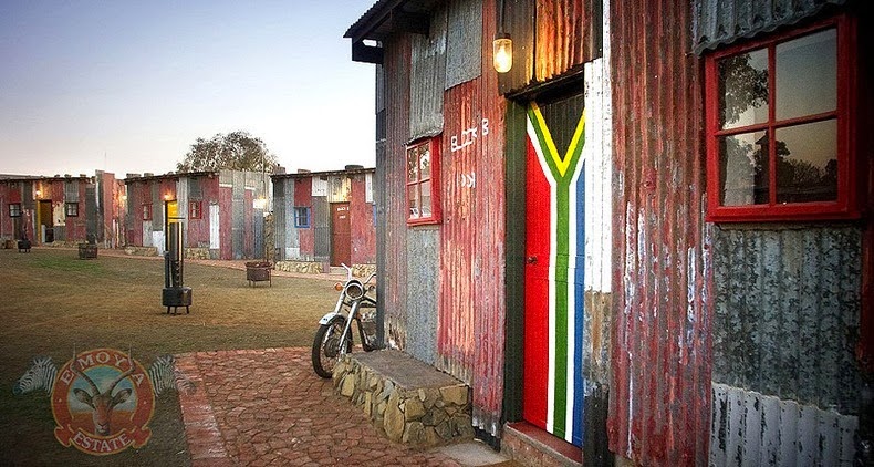
Shanty Town Emoya Resort
I honestly do not know what I feel about about this resort.
It's a discussion for another day though.
I guess creating an RDP hotel wouldn't be such a bad idea after all.
[Opened for discussion...]
Monday, 6 October 2014
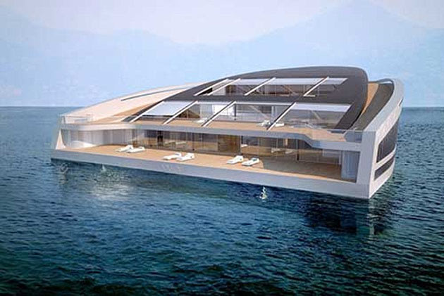
Floating Homes of the Future
WHY Floating Home
With more than 3,000 square feet of living surface and three levels of decking, the WHY concept yacht is designed for living — and entertaining. In part, what distinguishes the design is its emphasis on sustainability (relative to other yachts.) The vessel relies on thermal energy and recycled organic and inorganic waste, ideally resulting in a low impact on the sea. Luxurious and easy on the eye, the minimalist interiors features walls of glass, modern furnishings, an elaborate curved staircase and a tree growing in the center of the living space.
For more Floating Homes Concepts: https://homes.yahoo.com/news/floating-homes-of-the-future.html
"I wonder where the world might run out of land at some point which will redirect us as Architects to look more into building in homes in the ocean. Something along the lines of Venice...
It really is a fascinating idea from what I could say. Ofcourse, there is so much to consider which is the same building on land but all in all, it is just an open idea..." by Phumulani M. Zwane

Sunday, 28 September 2014
The Natural Jacuzzi in Satania Italy
Terme di Saturnia are a group of lush geothermal springs located in the municipality of Manciano, just a few kilometres from the village of Saturnia, Italy.
The thermal waters of Saturnia have a series of cascades at 37°, where nature forms dozens of beautiful pools at different levels.
- Terme di Saturnia – Photo by: Al Brando – Flickr
- Terme di Saturnia – Photo by: Al Brando – Flickr
The hot water springs from a volcanic crater gushes from deep down in the earth at an unbelievable rate of 800 gallons per second and then flows along a natural stream until drop as a waterfall, known as the Cascate del Mulino.
- Saturnia – Cascate del Mulino – Photo by: candido33 – Flickr
- Terme di Saturnia Pools and Cascate del Mulino – Photo by: candido33 – Flickr
Locals in this area think the Cascate del Mulino are their best-kept secret. It laps against an old mill and then goes on to form a series of natural pools of travertine rock carved over the centuries. Immersed in the picturesque Tuscan landscape, the tiny pools are filled by smaller waterfalls flowing from one pool to another.
- Terme di Saturnia – Photo by: yanmicols – Flickr
This region’s renown goes way back to the Pre-Roman age, and was even used by Roman nobles. The sulphurous spring water, at a temperature of 37.5 °C all year round, are believed to have health benefits, offering relaxation and well being through immersion.
- Terme di Saturnia Natural Pools – Photo by: candido33 – Flickr
Most tourists enjoy the same water in the world-renowned spa complex down the road, sitting in a man-made pool, completely unaware of these naturally carved rock wells that seem like Jacuzzis in the middle of Paradise.
- Ref: http://www.worldtoptop.com/jacuzzis-in-paradise-terme-di-saturnia/?utm_source=rss&utm_medium=rss&utm_campaign=jacuzzis-in-paradise-terme-di-saturnia
Wednesday, 17 September 2014
Forbes Life
The high price tag for 775 S. Mashta Drive, on Key Biscayne, an island off Miami’s coast, is due to the land, not the house itself. The property encompasses two acres and 2,000 feet of water frontage and is comprised of three buildable plots, meaning that two additional homes could potentially be constructed. “I dare to say it’s one of the nicest pieces of property in all of the Eastern Seaboard, not just Miami,” says listing agent Jorge Uribe of ONE Sotheby’s International Realty.
The land at 775 S. Mashta is also completely man-made. By 1908, a wealthy industrialist named William John Matheson had purchased most of Key Biscayne. Matheson made his fortune in aniline dyes, eventually merging his company with four others to form Allied Chemical and Dye Corporation. He owned some 1,700 acres of Key Biscayne, or the northern two-thirds of the island, according to a 2008 article in the Miami Herald, where he planted tropical fruits and coconuts and eventually developed the nation’s largest coconut plantation. On the southeastern side of the island, he created a hook of land (by dredging and filling with landfill) where he built his own private palace.
Plans for Mashta House, as the residence became known, were inspired by architecture Matheson saw on a trip up the Nile. The Heraldarticle describes Mashta House as a loggia with “rustic log-beamed ceilings and lush wall coverings,” covered in “enigmatic murals and decorative paintings of mystical symbols.” No one ever lived in this dwelling, whose Egyptian name meant “resting place.” In the early part of the century Matheson floated his friends over by yacht–among them Vanderbilts, Carnegies, and Mellons–to enjoy the gorgeous views and to party.
Much of the land that is today the site of Miami’s most expensive homes–Star Island, Hibiscus Island, even much of Miami Beach–was created via landfill by developers looking to create lots for the well-off. But 775 S. Mashta Drive has the distinction of being a landfill parcel that an industrialist created for himself, Uribe says. “He created this whole hook, and he built this fantastic house and had it as entertainment, a party palace for all his friends.”
The Matheson family sold in the middle of the 20th century as Key Biscayne was being developed. Sadly, the early 20th-century Mashta House is no more. It has been replaced by a simple, rectangular five-story, with six bedrooms and eight bathrooms, built in 1991. The house has marble floors and a pared down, Latin American feel. There are no fancy columns or architectural flourishes to distract from the fantastic views. Uribe says a buyer might slice off the roof and convert the home to the contemporary style that is in vogue with luxury buyers these days.
In recent years the home has been a luxury rental, renting most recently for $50,000 per month. The Latin American owners are selling because they haven’t used it for several years, and because the timing is good since the market has recovered, Uribe said. Miami-Dade public records list the property owners as Pitu Inc.
The most expensive single-family home sale in Miami to date is the $47 million sale of 3 Indian Creek in 2012. (The Alexander Team of Douglas Elliman shared the listing with The Jills of Coldwell Banker Previews International; the Alexander brothers also represented the buyer.) Prior to that deal, Eddie Lampert’s purchase of 14 Indian Creek the $40 million sale of the same year held the record for the highest-priced Miami residence. (Uribe represented both sides in that deal.)
Last year the penthouse at Faena House, a new condo tower in Miami Beach, went into contract for over $50 million, making it the most expensive condo–and residential transaction overall–in Miami.
Photo Credit: Jason Spiewak
Wednesday, 3 September 2014
Wright House by Elmo Swart Architects in Durban, South Africa
A stunning modern attachment to a traditional hut-home in Durban, South Africa by Elmo Swart Architects. The contemporary addition on the old thatched-roof home is quite a contrast to the original design. The smooth, angled curves of the exterior shape echo the original, and natural accents are added to make the transition from old to new more visually balanced.
http://urbanpeek.com/2012/05/31/wright-house-by-elmo-swart-architects-in-durban-south-africa/
Subscribe to:
Comments (Atom)


.jpg)


.jpg)


