Monday, 20 October 2014
Tuesday, 14 October 2014
University of Pretoria: Administration Building
I thought I should share one of the buildings that always catch my eye, and I could never get fed up of seeing it. The University of Pretoria Administration Building by Brian Sandrock.

Sketch-up Model by Miss C D Deacon
"In 1965 it was decided to construct a new administration building and UP alumnus Brian Sandrock was commissioned for the design. He designed an interesting three-cornered, star-shaped building which was completed in 1968. By 1973 additional office space was required and Sandrock was again commissioned to design a wing to the east of the building. Construction on this wing began in 1979 and was completed in 1986. The wing includes the offices of the Principal, Council Chambers and the Senate Hall. The building shows traces of Neo-Brutalism and is shaped like a ship – hence the student name of Die Skip (The Ship). The north-western facade of the building comprises an intricate relief mural which adds texture to the otherwise bland concrete wall. Sandrock later commented that there was no symbolism behind the design and that it was simply the result of doodling in plaster of Paris late at night while he worked on the model of the building. Sketchup model drawn by Miss C D Deacon"
Ref: http://repository.up.ac.za/handle/2263/6558
Wednesday, 8 October 2014
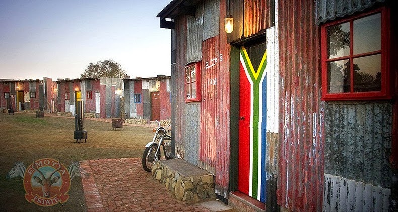
Shanty Town Emoya Resort
I honestly do not know what I feel about about this resort.
It's a discussion for another day though.
I guess creating an RDP hotel wouldn't be such a bad idea after all.
[Opened for discussion...]
Monday, 6 October 2014
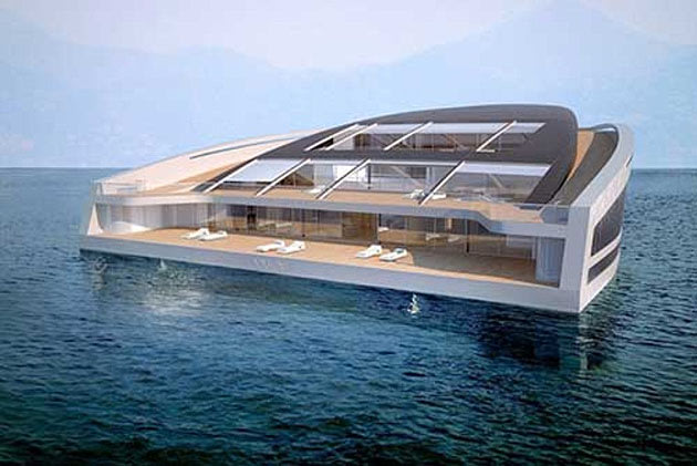
Floating Homes of the Future
WHY Floating Home
With more than 3,000 square feet of living surface and three levels of decking, the WHY concept yacht is designed for living — and entertaining. In part, what distinguishes the design is its emphasis on sustainability (relative to other yachts.) The vessel relies on thermal energy and recycled organic and inorganic waste, ideally resulting in a low impact on the sea. Luxurious and easy on the eye, the minimalist interiors features walls of glass, modern furnishings, an elaborate curved staircase and a tree growing in the center of the living space.
For more Floating Homes Concepts: https://homes.yahoo.com/news/floating-homes-of-the-future.html
"I wonder where the world might run out of land at some point which will redirect us as Architects to look more into building in homes in the ocean. Something along the lines of Venice...
It really is a fascinating idea from what I could say. Ofcourse, there is so much to consider which is the same building on land but all in all, it is just an open idea..." by Phumulani M. Zwane

Subscribe to:
Comments (Atom)


